Consulting, convening, coding, covering new ground, plus occasional commentary.
coding
Design adventures with Style Tiles at The Tyee
There’s a little project underway at The Tyee, a re-launch of one of the sections and possibly a related microsite, and we decided to use this moment as an opportunity to try a different approach to how we work through the graphic design considerations.
In the past, we would have given a long list of requirements, and possibly wireframes, to our graphic designer, Alex Grunenfelder. There would have been many conversations about what types of pages he was designing, what content would be on those pages, and so on. And, ultimately, Alex would deliver stunning designs as a layered Photoshop file and away we’d go.
However, times have changed, and – as most folks already know – there’s a Web revolution underway that started in your pants. So, knowing that we’re heading in the direction of a responsive Web, it made sense to re-visit our approach to graphic design for the Web.
We basically had two options:
-
Think through all of the content requirements for the screen sizes that we wanted to target and have Alex work through the design for each one. The result would likely be several Photoshop files, one for each screen, and any changes in direction we made would then need to be applied to each file. Seemed laborious and not very future-friendly.
-
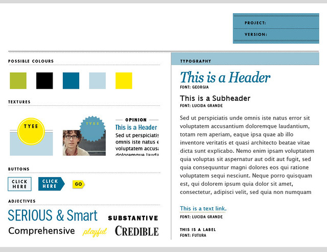
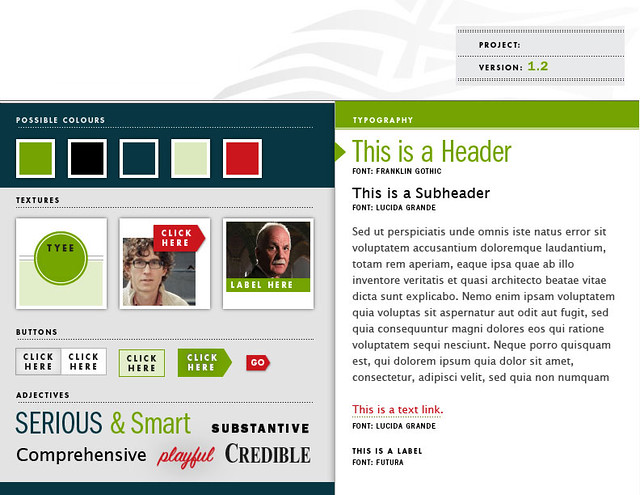
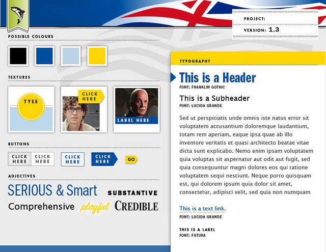
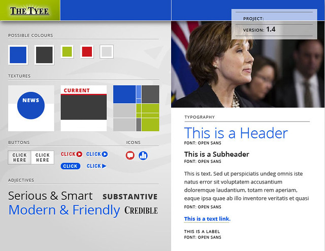
Have Alex develop a “visual language” for the project – colour palette, typography, textures, and treatments for various common elements – that we could then apply to the site as it evolved from wireframes toward reality.
The later approach, now commonly referred to as “Style Tiles” (though, we used to just call this a “style guide” back in 1999), makes a lot of sense in a world where new devices and new screen sizes are introduced every year.
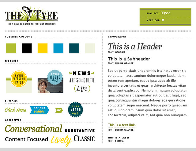
We decided on the Style Tiles option and Alex was happy to play along. I’ve included a few of our favourites from the exercise below (minus the spoiler details). Alex also provided a Style Tile for the existing site (shown at the top of this post) that was quite helpful to have for context.
Where this approach really worked was right at the beginning when we wanted to explore a bunch of different ideas quickly, and with minimal “constraints” that often arise from existing graphic elements on a site. The tiles quickly enabled everyone involved to come to an agreement on the visual voice for the new section.
For parts of the project that will not be responsive, we sent the wireframes back to Alex and the process went in the more traditional direction where he delivered a layered Photoshop that presents the style tiles applied to the wireframe. As always, it looks amazing.
It remains to be seen if we can maintain the same level of design sophistication in the responsive part of the project, without the structured guidance of a pixel-perfect Photoshop file. Fingers crossed.
Are you working with Style Tiles? I’m interested in your experiences. Drop me a note in the comments here, or on Twitter.
About
Hi, I'm Phillip Smith, a veteran digital publishing consultant, online advocacy specialist, and strategic convener. If you enjoyed reading this, find me on Twitter and I'll keep you updated.

Related
Want to launch a local news business? Apply now for the journalism entrepreneurship boot camp
I’m excited to announce that applications are now open again for the journalism entrepreneurship boot camp. And I’m even more excited to ...… Continue reading
Previously
A simple workflow for developing maintainable Wordpress sites
From the future
Slacker lesson No. 1: Hire a truly fscking great hosting company